

Click to View Prototype
A Case Study
2024 Enhancements Coming Soon!
College Literate
A Product that empowers first generation, adult, and parent-students exploring higher education.
My Role:
Sole UX/UI Designer + Researcher
Tools:
Figma, InVision, Miro
The Process
1.Defining the Problem
It’s extremely hard for adults and first generation college goers to get unbiased university, financial aid, and vocational school advice.
2. Research
My research plan aimed to determine the biggest problems these students face, and what they need to improve their enrollment and higher education experiences. This was conducted through secondary research via reading peer reviewed journals, as well as a screening survey and user interviews.
I synthesized the information gleaned in the interviews by creating affinity maps and empathy maps with Miro. From there I created three personas that described my three most likely users. These activities helped refine the problem by discovering the biggest pain points.
Once these pain points were defined, I began brainstorming by presenting myself with several How Might We statements. I came up with six essential HMW’s.
3. Ideation
Ideation was mainly done through sketching and exercises, such as crazy 8’s and what I called 5 in 5 and 6 in 6 (same concept). This helped me visualize practical solutions to the HMWs. I did a timed sketch group for each HMW statement (which resulted in six pages of ideas).
4. Information Architecture
I built out my user stories in a document with high, medium, and low priorities. This helped me visualize how I could best build up three important red routes and site maps for the final prototype.
I created a site map by exploring the best way to lay out the pages and ask what calls-to-action are necessary for users to easily achieve their goals. I made my decisions primarily based on my user stories.
From these two pieces I built 3 essential red routes/user flows.
5. Design
I created clean sketches built on my red route mapping, and ideation drawings. I did my sketches digitally so that I could easily share and refer to them when wireframing. Then I created my wireframes, inspired by the sketches, in Figma.
I used Figma to design each high-fidelity screen based on my user flows and red routes.
6. Prototyping + Testing
I used inVision to create a clickable prototype for user testing.
During testing I had the users complete 3 tasks (the red routes).The objective was to test the product’s usability, and user’s emotional reaction to it. I hoped to glean useful information that might help to fine tune the College Literate user experience.
The participants were close to my ideal users- adults over the age of 21, preferably having been, or have the desire to go to college.
The tests were moderated but performed over live Zoom calls.
7. Refining the Solution
I took the notes I received from the users and placed comments and designating arrows onto the Figma files at areas of concern. This helped me visualize and empathize with the users’ frustrations.
I also created a document of the most common issues found and made a priority list for edits. I used this table of high to low priority to direct my redesigning process.
Then I finally had a beautiful final product to be proud of!
The Problem
It’s extremely hard for adults and first generation college goers to get unbiased university, financial aid, and vocational school advice.


2. Research
According to my secondary research, it is clear that there is a major need for college and vocational training resources for first generation, adults, and parent-students. These groups actually make up for more than half of college-goers. The current systems in place are ideal for high school students (via school counselors), current college students, who only get biased advising, and presumes most students have contact with people who have gone to college already. Regardless of history, students are expected to automatically understand college verbiage, systems and processes.
These data illuminates some major points of concern for these students, including advising and mentoring, financial planning and prepping, childcare resources, and moral support.

Interviews
Primary research: Interviews. The objective here was to determine the biggest problems these students face, what they need to improve their enrollment and higher education experiences. I selected participants. based on the survey shared primarily on social media. Interviewing and recording was done over the course of two weeks. The interviews were conducted remotely over zoom and video or audio recorded. I used a script so that I could focus on the most pressing questions during our conversations.
The important characteristics of interviewees included:
Identifies as a current or past older adult, parent, or first generation student
Somewhat negative experience(s) with the enrollment, financial aid, and college systems
Is a resident of the U.S.A.
During the interviews I learned that many of these students’ personal experiences lined up with the information found during secondary research. These people had all felt marginalized, confused, and extremely anxious about the higher-education process.
3. Refining the Problem
I synthesized the information gleaned in the interviews by creating affinity maps and empathy maps with Miro. From there I created three personas that described my three most likely users. These activities helped refine the problem by discovering the biggest pain points.
Once these pain points were defined, I began brainstorming by presenting myself with several How Might We statements. I came up with six essential HMW’s.


The three personas I built helped me visualize what an actual user might look like, act like, and feel like. I focused strongly on my empathy maps to inform my persona ideations. I wanted to ask myself, What can I do for Marta? and How could I help Sila pursue her dreams? I kept these personas on the forefront of my mind during the designing process.


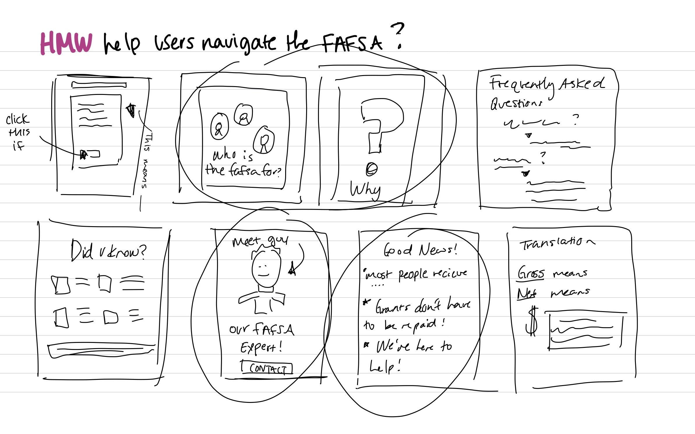
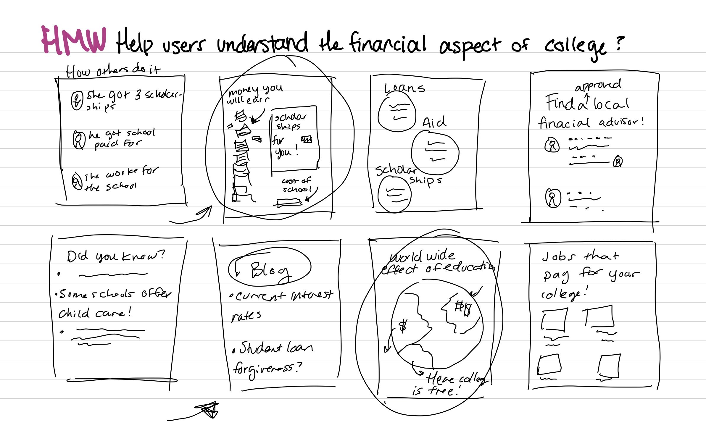
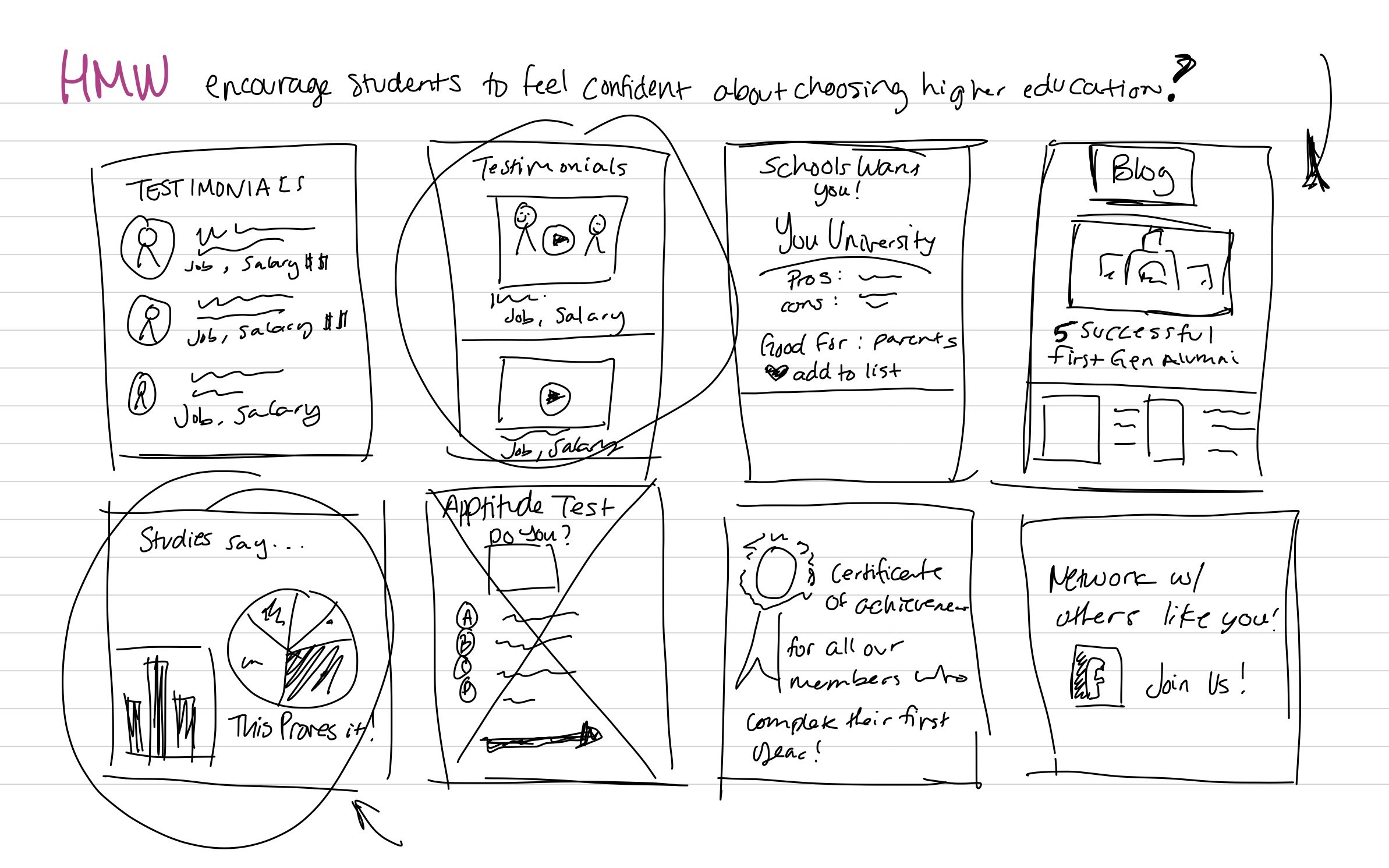
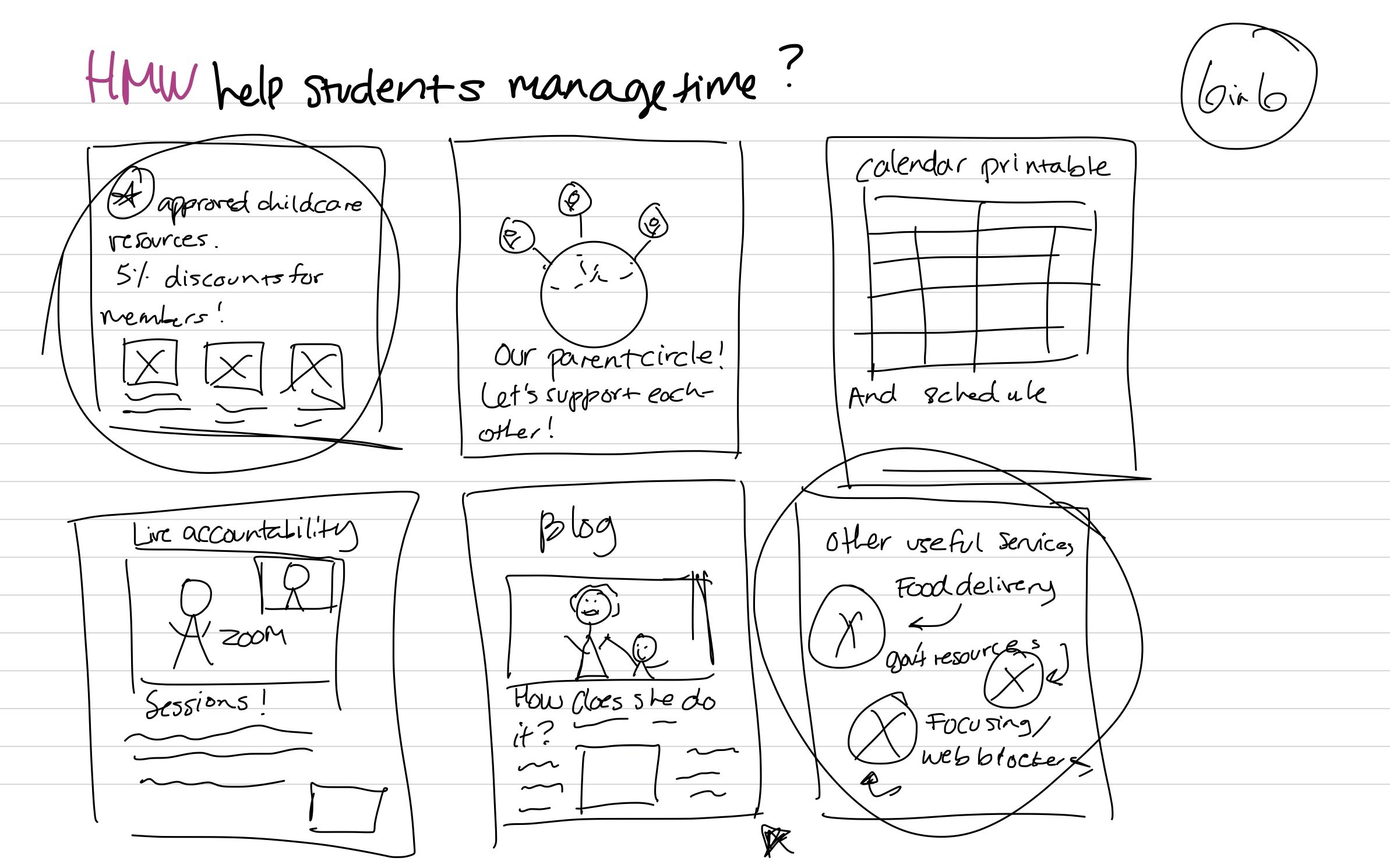
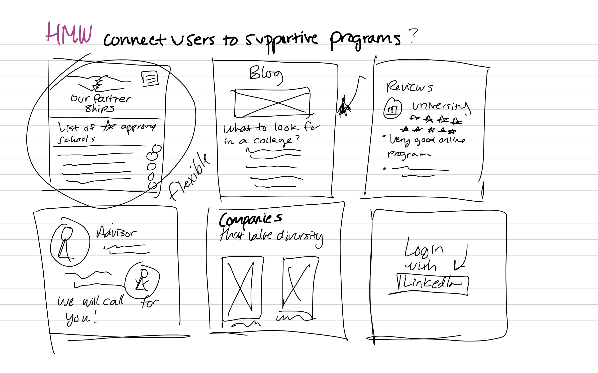
How Might We Statements
4. Ideation
Ideation was mainly done through sketching, and exercises such as crazy 8’s, and what I called 5 in 5 and 6 in 6 (same concept). This helped me visualize practical solutions to the How Might We statements. I did a timed sketch group for each HMW statement (which resulted in six pages of ideas).

5. Information Architecture
I built out my user stories in a simple word document with high, medium, and low priorities. This helped me visualize how I could best build up three important red routes and site maps for the final prototype.
I created a site map by exploring the best way to lay out the pages and ask what calls-to-action are necessary for users to easily achieve their goals. I made my decisions primarily based on my user stories.
From these two pieces I built 3 essential red routes/user flows. Spoiler: I ended up with four red-routes, after my user testing, more on that later.


6. Design
I carefully crafted some refined screen sketches based on my red route mapping and ideation drawings. I drew my sketches digitally so that I could easily share and refer to them when wireframing. I brought them into Figma when it was time to wireframe so that I could visually pair them for easy reference.
[Along the information listed here, I created a brand identity, moodboard and style guide for this product. I decided to create it as a separate case study because to the extensive work that went into that alone.] That said, some important things to note is that the colors, the logo, the font and overall feel of the app, all were carefully thought out in light of how I wanted College Literate’s brand to come across.
Sketches
(click screens to enlarge)
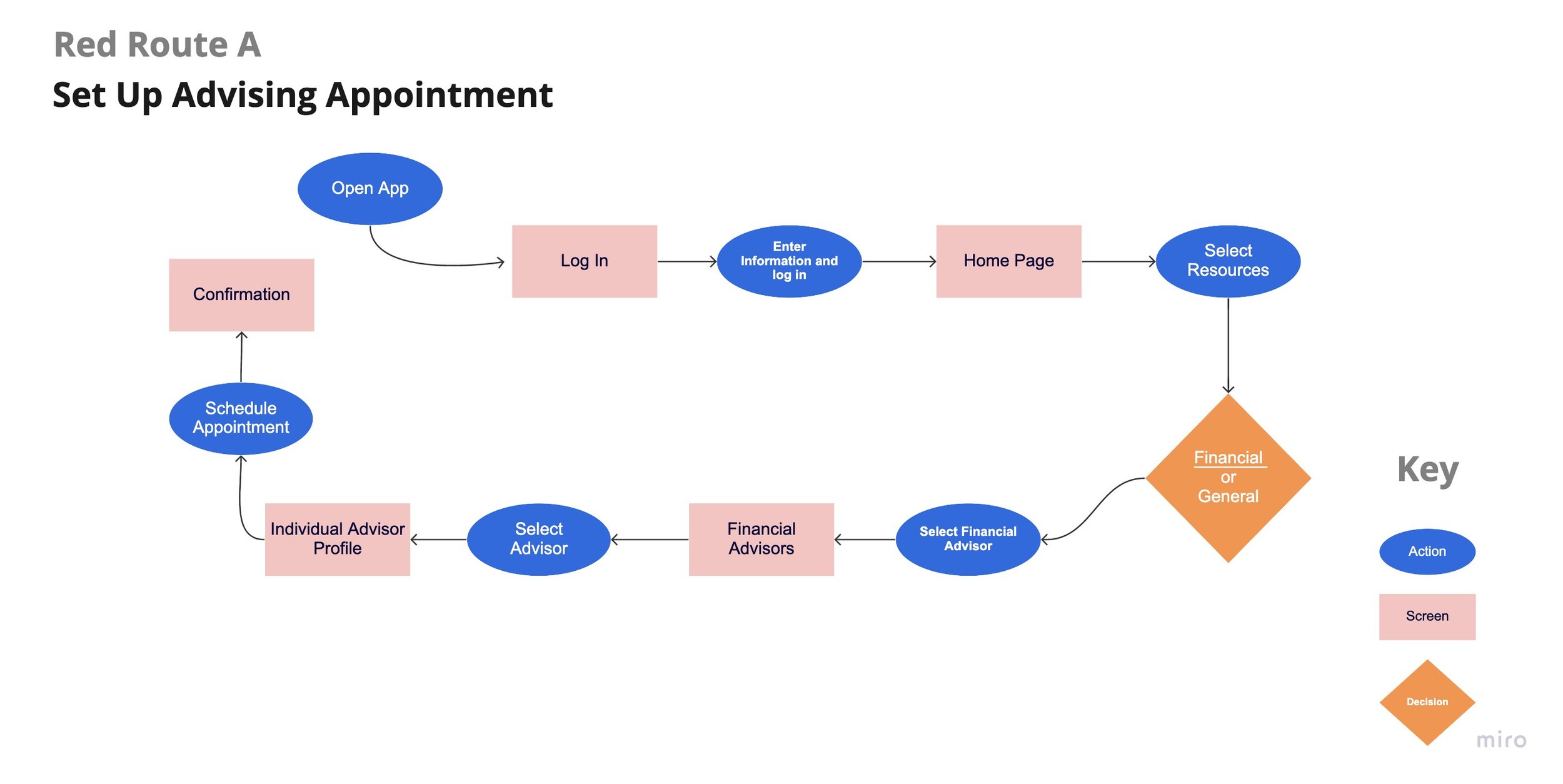
Red Route #1
The goal here is for the user to schedule an appointment with an advisor, so that they can have the right tools and advice they need.


Red Route #2
Here the user is adding a college to their favorites list so that they can refer to it when making decisions for where to apply.


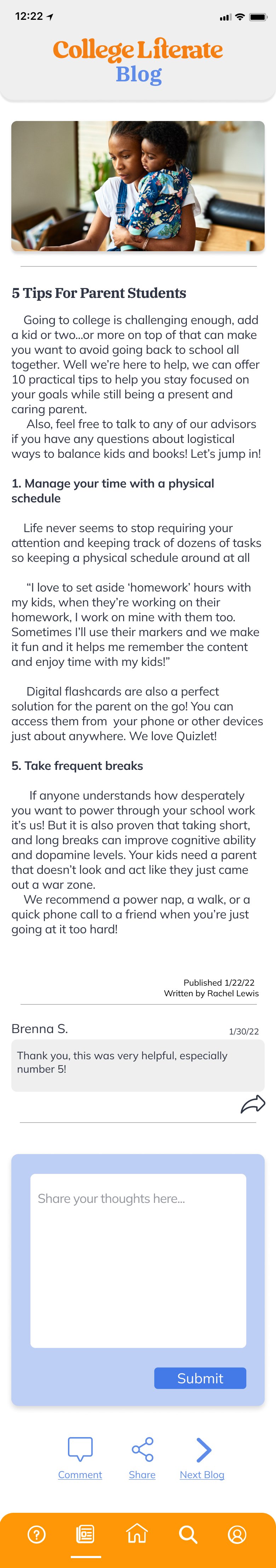
Red Route #3
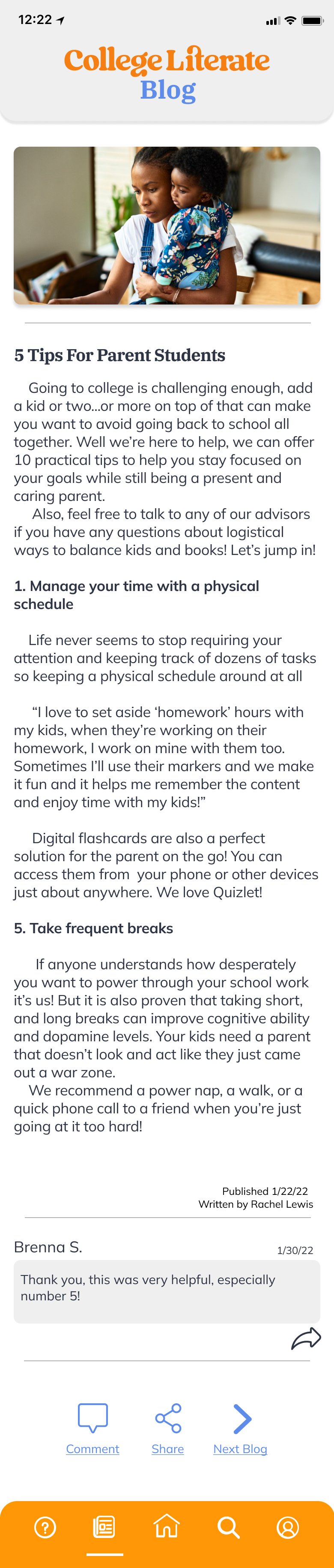
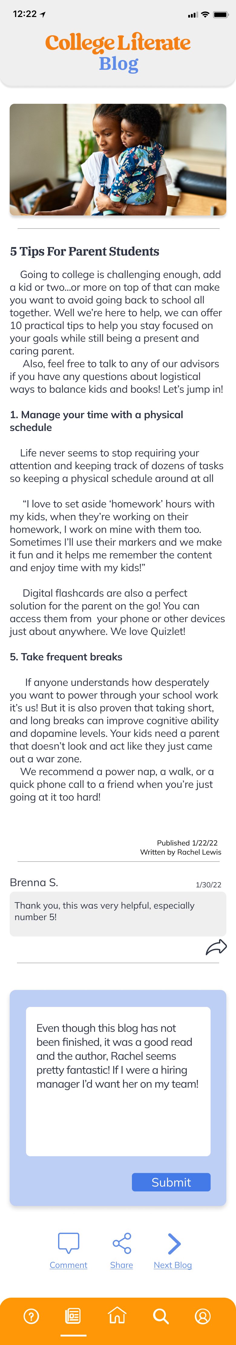
The user here is viewing the blog and commenting so that they can read about and connect with common college situations.


Wireframes
Then I created my wireframes, inspired by the sketches, in Figma. I placed the sketches adjacent to the wireframes so that I could easily reference them. During iteration I would place various options below the screens that I ended up going with. So you’ll notice a line of several screens going vertically, but final decisions were placed on a horizontal pathway.
(click screens to enlarge)
Red Route #1
(click screens to enlarge)


Red Route #2
(click screens to enlarge)


Red Route #3
(click screens to enlarge)


High Fidelity Screens
Finally! It was time to start visualizing the high fidelity designs. Using Figma I designed each screen based on my user flows and red routes. As I did when designing the wireframes, I laid out the wireframe screens adjacent to the high-fi screens and kept them present during the build to easily refer to them. For iterations of certain screens I placed other design options below the original/final screens. Each red route is built on a separate page within the Figma file.
Red Route #1
(click screens to enlarge)


Red Route #2
(click screens to enlarge)


Red Route #3
(click screens to enlarge)


7. Prototyping + Testing
I used inVision to create a clickable prototype for user testing. For testing I let each participant know that I didn’t want them to feel concerned about hurting my feelings or holding back in any way, I’ll told them that I wanted them to nitpick the product so I could create a better product. I had the users complete 3 tasks (the red routes), as well as give me their thoughts on each page they landed on.
The objective was to test the product’s usability, and user’s emotional reaction to it. I hoped to glean useful information that might help to fine tune the College Literate user experience.The participants were close to my ideal user- adults over the age of 21, preferably having been, or have the desire to go to college. The tests were moderated but performed over live Zoom calls.
9. Refining the solution
I took the main notes I received from the users and placed comments and designating arrows onto the Figma files at areas of concern. This helped me visualize and empathize with the users’ frustrations.
I also created a document of the most common issues found and made a priority list for edits. I used this table of high to low priority to direct my redesigning process.

At last, a product to be proud of! So many great changes were done after testing, including adding a red route for onboarding. I felt like this was important because a lot of the users mentioned how important it was to them to really understand each resource and how it can be useful to them. In reality, each user would undergo an onboarding process so I decided to build it into the prototype. Another important thing was adding a screen for the search page on the bottom navigation. This allows users to choose to search between advisors or schools without returning to the home page.

New Site Map
Now please explore the final prototype, if you haven’t already!

The home page was cleaned up and turned into a scrolling screen to allow the user to easily focus on the content. The bright blue was muted slightly and the cards enlarged to remove the feeling of advertisements. I also added a light heading block to all the parent pages. I addressed all the problems in the above table to create a much more user friendly product!
Check out the final screens!
New Route #.01
This is where I created the onboarding process.
(click screens to enlarge)


New Route #1 + 2
First to schedule an appointment with an advisor and add a school to favorites list.
(click screens to enlarge)


New Route #3
View and comment on a blog.
(click screens to enlarge)


Final Thoughts
Technical Discoveries
I enjoyed using InVision for this project prototype because I was able to quickly switchback and make minor changes where necessary. That said, it may not be my program of choice in the future based on issues with side scrolling and user challenges.
I was also able to use Miro for synthesizing and mapping, while there are of course many avenues for this, I found this to be a quick way to iterate and build attractive flows.
As I have a lot of past experience with Squarespace, as a web manager for some past clients, and for own website, so I found that I enjoyed creating this case study natively on Squarespace unlike other sites or templates.
Human Discoveries
This project was a huge growth point for me. This problem is personal to my own life, because I identify with all three users: an older, first gen, and a parent student. It was empowering to create a solution for myself as well as others. I would say I was most surprised by how much this project evolved from sketches to final screens.
The user testing was by far the most pivotal part of this process for me. The testing helped the final product turn into a true solution. I utilized feedback I received from my testers and in hindsight it was invaluable.
I am proud and grateful to be able to present this project as a founding piece to my portfolio.
Questions?
Hit me up on email, call or text if you want to discuss this case study with me more!